latest articles
Premium Blogger Templates

Πώς να ανακαλύψετε το κλειδί των Windows χωρίς κάποιο λογισμικό

Έχετε ξεχάσει που αποθηκεύσατε το κλειδί προϊόντος των Windows 8.1Windοws 8 ή Windοws 7;. Βαριόσαστε να  σκύψετε για να τον διαβάσετε από το αυτοκόλλητο των Windοws που είναι κολλημένο πάνω στο υπολογιστή σας; Τι; έχει σβηστεί από το αυτοκόλλητο ή δεν είναι ο ίδιος κωδικός με αυτόν που υπάρχει στα εγκατεστημένα Windows σας; Ασφαλώς το γνωρίζετε ότι μπορείτε να τον βρείτε χρησιμοποιώντας κάποιο πρόγραμμα τρίτου κατασκευαστή.
how-to-get-the-windows-product-key-without-using-third-party-software-2 windows
Όμως μερικοί χρήστες δεν θέλουν να τρέχουν για αυτή την κρίσιμη εργασία λογισμικά τρίτων προφανώς γιατί δεν τους εμπιστεύονται. Εμείς στο iGuRu.gr σήμερα θα σας δείξουμε μία απλή λύση για να βρείτε το κλειδί σας από το λειτουργικό σύστημα που είναι εγκατεστημένο στον υπολογιστή σας χωρίς να χρησιμοποιήσετε κάποιο λογισμικό.
1. Ανοίξτε το Σημειωματάριο ή το Notepad ή το Notepad++ για όσους το έχουν ήδη εγκαταστήσει
2. Αντιγράψτε και επικολλήστε το ακόλουθο κείμενο
function Get-WindowsKey {
    ## function to retrieve the Windows Product Key from any PC
    ## by Jakob Bindslet (jakob@bindslet.dk)
    param ($targets = ".")
    $hklm = 2147483650
    $regPath = "Software\Microsoft\Windows NT\CurrentVersion"
    $regValue = "DigitalProductId"
    Foreach ($target in $targets) {
        $productKey = $null
        $win32os = $null
        $wmi = [WMIClass]"\\$target\root\default:stdRegProv"
        $data = $wmi.GetBinaryValue($hklm,$regPath,$regValue)
        $binArray = ($data.uValue)[52..66]
        $charsArray = "B","C","D","F","G","H","J","K","M","P","Q","R","T","V","W","X","Y","2","3","4","6","7","8","9"
        ## decrypt base24 encoded binary data
        For ($i = 24; $i -ge 0; $i--) {
            $k = 0
            For ($j = 14; $j -ge 0; $j--) {
                $k = $k * 256 -bxor $binArray[$j]
                $binArray[$j] = [math]::truncate($k / 24)
                $k = $k % 24
            }
            $productKey = $charsArray[$k] + $productKey
            If (($i % 5 -eq 0) -and ($i -ne 0)) {
                $productKey = "-" + $productKey
            }
        }
        $win32os = Get-WmiObject Win32_OperatingSystem -computer $target
        $obj = New-Object Object
        $obj | Add-Member Noteproperty Computer -value $target
        $obj | Add-Member Noteproperty Caption -value $win32os.Caption
        $obj | Add-Member Noteproperty CSDVersion -value $win32os.CSDVersion
        $obj | Add-Member Noteproperty OSArch -value $win32os.OSArchitecture
        $obj | Add-Member Noteproperty BuildNumber -value $win32os.BuildNumber
        $obj | Add-Member Noteproperty RegisteredTo -value $win32os.RegisteredUser
        $obj | Add-Member Noteproperty ProductID -value $win32os.SerialNumber
        $obj | Add-Member Noteproperty ProductKey -value $productkey
        $obj
    }
}
3. Αποθηκεύστε το παραπάνω κείμενο σε ένα αρχείο με κατάληξη «. Ps1″ οπουδήποτε στο σκληρό σας δίσκο.
Επαλήθευση: Για να βεβαιωθείτε ότι μπορείτε να αποθηκεύσετε το αρχείο με την κατάληξη «.ps1″, μπορείτε να πληκτρολογήσετε το όνομα του μέσα σε διπλά εισαγωγικά , για παράδειγμα, «kleidi-windows.ps1″ .
how-to-get-the-windows-product-key-without-using-third-party-software-1 windows
4. Ανοίξτε την κονσόλα Powershell ως διαχειριστής πληκτρολογώντας » powershell » στο πεδίο αναζήτησης του μενού Έναρξης ή για τα Windows 8 πατώντας τα πλήκτρα Win + R και γράφοντας στο νέο παράθυρο τη λέξη powershell. Λογικά θα ανοίξει το παράθυρο Powershell.
5. Ενεργοποιήστε την εκτέλεση των τοπικών αρχείων που δεν έχουν ψηφιακή υπογραφή . Αυτό μπορεί να γίνει με την ακόλουθη εντολή :
Set-ExecutionPolicy RemoteSigned
6. Πατήστε το πλήκτρο Enter για να επιτρέψετε την πολιτική εκτέλεσης εντολών που πρέπει να αλλάξει.
7. Τώρα θα πρέπει να πληκτρολογήσετε την ακόλουθη εντολή :
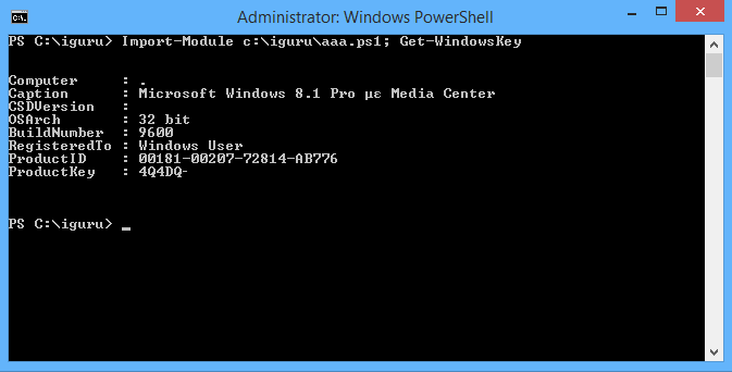
Import-Module C:\iguru\kleidi-windows.ps1; Get-WindowsKey
Σημείωση : Αλλάξτε τη διαδρομή προς το αρχείο kleidi-windows.ps1 στην παραπάνω εντολή, ανάλογα με την τοποθεσία όπου το έχετε αποθηκεύσει .
how-to-get-the-windows-product-key-without-using-third-party-software-2 windows
Και ορίστε!!! , έχετε το κλειδί προϊόντος που τώρα εμφανίζεται στην οθόνη σας!

Update: Ο χρήστης Giorgos Koliou είχε μία διαφορετική πρόταση, η οποία εργάζεται κανονικά, και σας την παραθέτουμε. Ευχαριστούμε θερμά τον φίλο μας για τα σχόλιά του.
Απλά κοπιάρετε αυτό σε ένα notepad++ με κατάληξη «.vbs», τρέξτε το και τέλος, έχετε τον κωδικό!
Set WshShell = CreateObject("WScript.Shell")
MsgBox ConvertToKey(WshShell.RegRead("HKLM\SOFTWARE\Microsoft\Windows NT\CurrentVersion\DigitalProductId"))

Function ConvertToKey(Key)
Const KeyOffset = 52
i = 28
Chars = "BCDFGHJKMPQRTVWXY2346789"
Do
Cur = 0
x = 14
Do
Cur = Cur * 256
Cur = Key(x + KeyOffset) + Cur
Key(x + KeyOffset) = (Cur \ 24) And 255
Cur = Cur Mod 24
x = x -1
Loop While x >= 0
i = i -1
KeyOutput = Mid(Chars, Cur + 1, 1) & KeyOutput
If (((29 - i) Mod 6) = 0) And (i <> -1) Then
i = i -1
KeyOutput = "-" & KeyOutput
End If
Loop While i >= 0
ConvertToKey = KeyOutput
End Function
Read more

3D Subscription Box Widget For Blogger


I created this subscription widget using CSS Facebook login form, which is available to preview or download here. It look's great and sleek. You can also use this widget on yourwordpress blog or on a static HTML page.

It's coded with pure CSS, no images were harmed during creation process. Don't removecredits, and you're free to use or share this widget.

Add This Widget To Blogger:

  • Go To Blogger > Layout > Add A Gadget > HTML/JavaScript
  • Paste following code:

<form action="http://feedburner.google.com/fb/a/mailverify" method="post" target="popupwindow" onsubmit="window.open('http://feedburner.google.com/fb/a/mailverify?uri=YOURFEEDID', 'popupwindow', 'scrollbars=yes,width=550,height=520');return true" class="login">
 <h1>Subscribe To Us</h1>
 <input type="hidden" value="YOURFEEDID" name="uri" />
 <input type="email" name="email" class="login-input" placeholder="Email Address" autofocus>
 <input type="hidden" name="loc" value="en_US" />
 <input type="submit" value="Subscribe" class="login-submit">
 <p class="login-help"><a href="http://www.bwidgets.com?src=fbform" rel="nofollow">Powered By: BWidgets</a></p>
</form>

<style>
::-moz-focus-inner {
  padding: 0;
  border: 0;
}

:-moz-placeholder {
  color: #bcc0c8 !important;
}

::-webkit-input-placeholder {
  color: #bcc0c8;
}

:-ms-input-placeholder {
  color: #bcc0c8 !important;
}

.input {
  font: 12px/20px "Lucida Grande", Verdana, sans-serif;
  color: #404040;
  background: #ebc9a2;
}

.input {
  font-family: inherit;
  font-size: 12px;
  -webkit-box-sizing: border-box;
  -moz-box-sizing: border-box;
  box-sizing: border-box;
}

.login {
  padding: 18px 20px;
  width: 200px;
  background: #3f65b7;
  background-clip: padding-box;
  border: 1px solid #172b4e;
  border-bottom-color: #142647;
  border-radius: 5px;
  background-image: -webkit-radial-gradient(cover, #437dd6, #3960a6);
  background-image: -moz-radial-gradient(cover, #437dd6, #3960a6);
  background-image: -o-radial-gradient(cover, #437dd6, #3960a6);
  background-image: radial-gradient(cover, #437dd6, #3960a6);
  -webkit-box-shadow: inset 0 1px rgba(255, 255, 255, 0.3), inset 0 0 1px 1px rgba(255, 255, 255, 0.1), 0 2px 10px rgba(0, 0, 0, 0.5);
  box-shadow: inset 0 1px rgba(255, 255, 255, 0.3), inset 0 0 1px 1px rgba(255, 255, 255, 0.1), 0 2px 10px rgba(0, 0, 0, 0.5);
}
.login > h1 {
  margin-bottom: 20px;
  font-size: 16px;
  font-weight: bold;
  color: white;
  text-align: center;
  text-shadow: 0 -1px rgba(0, 0, 0, 0.4);
}

.login-input {
  display: block;
  width: 90%;
  height: 37px;
  margin-bottom: 20px;
  padding: 0 9px;
  color: white;
  text-shadow: 0 1px black;
  background: #2b3e5d;
  border: 1px solid #15243b;
  border-top-color: #0d1827;
  border-radius: 4px;
  background-image: -webkit-linear-gradient(top, rgba(0, 0, 0, 0.35), rgba(0, 0, 0, 0.2) 20%, rgba(0, 0, 0, 0));
  background-image: -moz-linear-gradient(top, rgba(0, 0, 0, 0.35), rgba(0, 0, 0, 0.2) 20%, rgba(0, 0, 0, 0));
  background-image: -o-linear-gradient(top, rgba(0, 0, 0, 0.35), rgba(0, 0, 0, 0.2) 20%, rgba(0, 0, 0, 0));
  background-image: linear-gradient(to bottom, rgba(0, 0, 0, 0.35), rgba(0, 0, 0, 0.2) 20%, rgba(0, 0, 0, 0));
  -webkit-box-shadow: inset 0 1px 2px rgba(0, 0, 0, 0.3), 0 1px rgba(255, 255, 255, 0.2);
  box-shadow: inset 0 1px 2px rgba(0, 0, 0, 0.3), 0 1px rgba(255, 255, 255, 0.2);
}
.login-input:focus {
  outline: 0;
  background-color: #32486d;
  -webkit-box-shadow: inset 0 1px 2px rgba(0, 0, 0, 0.3), 0 0 4px 1px rgba(255, 255, 255, 0.6);
  box-shadow: inset 0 1px 2px rgba(0, 0, 0, 0.3), 0 0 4px 1px rgba(255, 255, 255, 0.6);
}
.lt-ie9 .login-input {
  line-height: 35px;
}

.login-submit {
  display: block;
  width: 100%;
  height: 37px;
  margin-bottom: 15px;
  font-size: 14px;
  font-weight: bold;
  color: #294779;
  text-align: center;
  text-shadow: 0 1px rgba(255, 255, 255, 0.3);
  background: #adcbfa;
  background-clip: padding-box;
  border: 1px solid #284473;
  border-bottom-color: #223b66;
  border-radius: 4px;
  cursor: pointer;
  background-image: -webkit-linear-gradient(top, #d0e1fe, #96b8ed);
  background-image: -moz-linear-gradient(top, #d0e1fe, #96b8ed);
  background-image: -o-linear-gradient(top, #d0e1fe, #96b8ed);
  background-image: linear-gradient(to bottom, #d0e1fe, #96b8ed);
  -webkit-box-shadow: inset 0 1px rgba(255, 255, 255, 0.5), inset 0 0 7px rgba(255, 255, 255, 0.4), 0 1px 1px rgba(0, 0, 0, 0.15);
  box-shadow: inset 0 1px rgba(255, 255, 255, 0.5), inset 0 0 7px rgba(255, 255, 255, 0.4), 0 1px 1px rgba(0, 0, 0, 0.15);
}
.login-submit:active {
  background: #a4c2f3;
  -webkit-box-shadow: inset 0 1px 5px rgba(0, 0, 0, 0.4), 0 1px rgba(255, 255, 255, 0.1);
  box-shadow: inset 0 1px 5px rgba(0, 0, 0, 0.4), 0 1px rgba(255, 255, 255, 0.1);
}

.login-help {
  text-align: center;
}
.login-help > a {
  font-size: 11px;
  color: #d4deef;
  text-decoration: none;
  text-shadow: 0 -1px rgba(0, 0, 0, 0.4);
}
.login-help > a:hover {
  text-decoration: underline;
}
</style>

Customizations:

In above code replace YOURFEEDID with your FeedBurner feed id. Also, you can change width of this widget by changing width: 200px; with your preferred width.
Read more

HOW TO ADD FLOATING WIDGET TO BLOGGER BLOG FOR ADS


Many bloggers have approval adsense account or other, but they don't get enough clicks, so they always think some tricks of floating widget for place adsense ads or other ads,

 For visitors eye attraction. So someone introduce floating widget for blogger blog that anyone can place adsense ads, affiliate ads or other ads. This trick generate more click on adsense or other ads. But  my dear friends i am not sure that if you place adsense ads or other ads on floating widget then they banned on your account or not, So must read carefully respected advertising network company agreement.


HOW TO ADD THIS WIDGET TO BLOGGER

  1. Go to Your Blogger Account.
  2. Click on Layout.
  3. Now Click on Add a Gadget (anywhere).
  4. Then HTML/JavaScript .
  5. And add the following code.
<style>
#AlamLife {
height:30px;
width:auto;
background: #005094 url('..');
background-repeat:repeat-x;
text-align:left;
padding-top:4px;
}
#adsground {
height:251px;
margin:0 auto;
width: 250px;
background:#fff;
border-bottom:2px #005094 solid;
border-right:2px #005094 solid;
border-left:2px #005094 solid;
text-align:center;
padding:4px;
}

#headlineatas {
opacity:1.0;
height:auto;
width:auto;
position:fixed;
top:65px;
left:10px;
border-bottom:1px #005094 solid;
border-bottom:0px blue solid;
color:#333;
padding:0px;
z-index:1001;
font-size:13px;}
</style>
<script type="text/javascript">
function getValue()
{
document.getElementById("headlineatas").style.display = 'none';
}
</script>
<div id="headlineatas">
<div id="AlamLife">

<span style="color:#fff;font-size:13px;font-weight:bold;text-shadow:black 0.1em 0.1em 0.1em"></span>
<span style="color:#fff;font-size:13px;font-weight:bold;text-shadow:black 0.1em 0.1em 0.1em;float:right;padding-top:3px;padding-right:10px"><a href="http://www.alamlife.com/2013/08/how-to-add-floating-widget-to-blogger.html" target="_blank" onclick="getValue()">close(x)</a></span>
</div>
<div id="adsground">
<h3>
</h3>
<p align="left">
<h3>
</h3>
</p>
<p>
your Ads code here

<br/></p>
</div>
</div>

CUSTOMIZE

  1. Replace "your Ads code here" with your own adsense or other ads code .
  2. You can change height and width by replacing its value 251px and 250px into your own .
  3. If you want to float on the right side then find the following code by pressing ( Ctrl + F ) on keyword .
  4. Find code   left:10px; 
  5. And replace with   right:10px;
  6. Now you have done ! .
Read more

LavaLamp - Fancy Css3 Menu for Blogger (5 colors).

css3 lavalamp menu

1. Go to blogger dashboard --> Template --> Edit Html (Tick expand widget template option).

2. Find(Ctrl+F) for closing header tag and opening outer tag, i.e.,
<div id='outer
or
<div id='outer
or
search for the word Outer and you will notice any of the above two codes.

3. Paste the following bulk code just above it.
<style>
/*LAVALAMP CSS3 Menu By BloggerTricks.Biz*/
.lavalamp {
    position: relative;
    border: 1px solid #d6d6d6;
    background: #fff;
    padding: 15px;
    -webkit-box-shadow: 0 3px 6px rgba(0,0,0,.25);
 -moz-box-shadow: 0 3px 6px rgba(0,0,0,.25);
    border-radius : 10px;
    -moz-border-radius : 10px;
    -webkit-border-radius : 10px;
    background : -webkit-gradient(linear, left top, left bottom, from(rgb(240,240,240)), to(rgb(204,204,204)));
    background : -moz-gradient(linear, left top, left bottom, from(rgb(240,240,240)), to(rgb(204,204,204)));
    height: 18px;
}
.magenta {
 background : rgb(190,64,120);
 background : -webkit-gradient(linear, left top, left bottom, from(rgb(190,64,120)), to(rgb(177,24,91)));
 background : -moz-gradient(linear, left top, left bottom, from(rgb(190,64,120)), to(rgb(177,24,91)));
 border: 1px solid #841144;
 }
.cyan {
 background : rgb(64,181,197);
 background : -webkit-gradient(linear, left top, left bottom, from(rgb(64,181,197)), to(rgb(7,165,187)));
 background : -moz-gradient(linear, left top, left bottom, from(rgb(64,181,197)), to(rgb(7,165,187)));
 border: 1px solid #2f8893;
 }
.yellow {
 background : rgb(255,199,79);
 background : -webkit-gradient(linear, left top, left bottom, from(rgb(255,199,79)), to(rgb(255,188,43)));
 background : -moz-gradient(linear, left top, left bottom, from(rgb(255,199,79)), to(rgb(255,188,43)));
 border: 1px solid #c08c1f;
 }
.orange {
 background : rgb(255,133,64);
 background : -webkit-gradient(linear, left top, left bottom, from(rgb(255,133,64)), to(rgb(255,107,24)));
 background : -moz-gradient(linear, left top, left bottom, from(rgb(255,133,64)), to(rgb(255,107,24)));
 border: 1px solid #c04f11;
 }
.dark {
 background : rgb(89,89,89);
 background : -webkit-gradient(linear, left top, left bottom, from(rgb(89,89,89)), to(rgb(54,54,54)));
 background : -moz-gradient(linear, left top, left bottom, from(rgb(89,89,89)), to(rgb(54,54,54)));
 border: 1px solid #272727;
 }
.magenta li a , .cyan li a, .yellow li a , .orange li a, .dark li a{
 color: #fff;
 text-shadow: 0 -1px 0 rgba(0,0,0,.40);
 }
.lavalamp a {
    text-decoration: none;
    color: #262626;
    line-height: 20px;
}
.lavalamp ul {
    margin: 0;
    padding: 0;
    z-index: 300;
    position: absolute;
}
.lavalamp ul li {
    list-style: none;
    float:left;
    text-align: center;
    }
.lavalamp ul li a {
    padding: 0 20px;
    text-align: center;
    }
.floatr {
    position: absolute;
    top: 10px;
    z-index: 50;
    width: 70px;
    height: 30px;
    border-radius : 8px;
    -moz-border-radius : 8px;
    -webkit-border-radius : 8px;
    background : rgba(0,0,0,.20);
    -webkit-transition: all .4s ease-in-out;
    -moz-transition: all .4s ease-in-out;
}
/*LAVALAMP CSS3 Menu By BloggerTricks.Biz*/
</style>
<script src='http://yourjavascript.com/3131111161/jquery-1.4.1.min.js'/>
<script src='http://yourjavascript.com/1414311106/lavalamp.js'/>
<div class='lavalamp'><ul>
<li class='active'><a href='/'>Home</a></li>
<li><a href='YOUR-LINK-HERE'>Link 1</a></li>
<li><a href='YOUR-LINK-HERE'>Link 2</a></li>
<li><a href='YOUR-LINK-HERE'>Link 3</a></li>
<li><a href='YOUR-LINK-HERE'>Link 4</a></li>
<li><a href='YOUR-LINK-HERE'>Link 5</a></li></ul>
<div class='floatr'/>
</div>

Customization:

  • Replace YOUR LINK HERE with your links.
  • Replace Link 1/2/3/4/5 with your menu elements.
Note:-
Replace <div class='lavalamp'> with
<div class='lavalamp orange'>
<div class='lavalamp yellow'>
<div class='lavalamp cyan'>
<div class='lavalamp magenta'>
<div class='lavalamp dark'>

Depending on your choice. . Lavalamp css3 menu with each of these colors are showcased in the Demo given above.


4. Finally save the Template.

Now you can notice Lavalamp Css3 menu working perfect in between the header and the post body of your blog as shown in the below demo.


Hope you enjoyed this menu. Please take some time to share this tutorial with your friends. Kindly give your feedback about this in the comment section below.

Read more

Jquery Featured Social Slider Widget

jquery social slider widget


Jquery Featured Social Slider Widget for Blogger

1. Go to blogger dashboard --> Template --> Edit Html.

2. Find(Ctrl+F) for <body> tag and Paste the following peace of code just below it.

<div class='clear'/>
<style>
/*Social Sharing Top Slider WIdget By BloggerTricks.Biz*/
ul#navigation {
position: fixed;
margin: 0px;
padding: 0px;
top: 0px;
right: 0px;
list-style: none;
z-index:999999;
width:721px;
}
ul#navigation li {
width: 103px;
display:inline;
float:left;
border:0;
}
ul#navigation li a {
display: block;
float:left;
margin-top: -2px;
width: 100px;
height: 25px;
background-color:#eeeeee;
background-repeat:no-repeat;
background-position:50% 10px;
border:1px solid #BDDCEF;
-moz-border-radius:0px 0px 10px 10px;
-webkit-border-bottom-right-radius: 10px;
-webkit-border-bottom-left-radius: 10px;
-khtml-border-bottom-right-radius: 10px;
-khtml-border-bottom-left-radius: 10px;
text-decoration:none;
text-align:center;
padding-top:80px;
opacity: 0.96;
filter:progid:DXImageTransform.Microsoft.Alpha(opacity=70);
}
ul#navigation li a:hover{
background-color:#CAE3F2;
}
ul#navigation li a span{
letter-spacing:2px;
font-size:11px;
color:#60ACD8;
font-family:trebuchet-ms, arial, tahoma, Sans-Serif;
font-weight:bold;
text-shadow: 0 -1px 1px #fff;
}
ul#navigation .facebook a {
background-image: url(https://blogger.googleusercontent.com/img/b/R29vZ2xl/AVvXsEjxIrAC8GkNZOxOkYTx2lQ9UDmoDwVUFdhVqBGBWbJ4u_aOFsWMZ_k9g5Rizbduk3i_oGVu_FrZqUAP4MDiBUcVq3KeOcPyPol5x2RQHF4KGL25lxxwuoYKeXP6pAibJ4Uid9on1pO3-YE/s1600/%5Bbloggertricksdotbiz%5DFACEBOOK.png);
}
ul#navigation .twitter a {
background-image: url(https://blogger.googleusercontent.com/img/b/R29vZ2xl/AVvXsEgxiK2JMlCc7JJ-Zx3fkAAFGJUXJETparW-Ooq2Ck9VOkxQuk1zIet4W69VjctdnVvGw9U3Wn9ZhC3TKrCVNGBxW_6rdIFOmnjRShATKzxAE8QtB_eKIvxq7L4cgnZk27evKaJj0QOwrRA/s1600/%5Bbloggertricksdotbiz%5DTWITTER.png);
}
ul#navigation .googleplus a {
background-image: url(https://blogger.googleusercontent.com/img/b/R29vZ2xl/AVvXsEi5LmWAhZXvBEhjhwur_dd1_E1v-aVAbPNyvswXyCE4jmc7VFzgi64MoVRbtn3qQv3ncalnjoYNzbNXmeT3XPDs4nC3q8_9s7qL0wcTmkX-w9diqNvXVdssP7v24A97cM7b-iYnm6T4dZs/s1600/%5Bbloggertricksdotbiz%5Dgplus.png);
}
ul#navigation .rss a{
background-image: url(https://blogger.googleusercontent.com/img/b/R29vZ2xl/AVvXsEjdlND69fRkDnlTa1WrZ9PI-MLx1Vl5o5kEB0rwT7jxrWyEeLX8Cqc4ufD9hFCt5s0p8KSvCcbRU04tEOgddKsPm1mc5LeX-OlSL_THY-F296LZy_9u8vaNfiR15M1MM0tqYQzYLLTbIs8/s1600/%5Bbloggertricksdotbiz%5DRSS.png);
}
ul#navigation .Contact a {
background-image: url(https://blogger.googleusercontent.com/img/b/R29vZ2xl/AVvXsEhqNGQ8JR0mNw9zO8uGAXx7AT4sBBmC3WtYhc6QLMkSzKi6m3ECdZQ8AX45xJHNMxJy0GlfyCQjXvRZbhKfuQfe2i6abOt4KImzVEreJbIG0OIQOl697bXbvWNdQPBie06ueVGaE2CFnEI/s1600/%5Bbloggertricksdotbiz%5Dcontact.png);
}
/*Social Sharing Top Slider Widget Style End By BloggerTricks.Biz*/
</style>
<script src='http://jqueryjs.googlecode.com/files/jquery-1.3.2.js' type='text/javascript'>
</script>
<script type='text/javascript'>
$(function() {
var d=300;
$(&#39;#navigation a&#39;).each(function(){
$(this).stop().animate({
&#39;marginTop&#39;:&#39;-80px&#39;
},d+=150);
});
$(&#39;#navigation &gt; li&#39;).hover(
function () {
$(&#39;a&#39;,$(this)).stop().animate({
&#39;marginTop&#39;:&#39;-2px&#39;
},200);
},
function () {
$(&#39;a&#39;,$(this)).stop().animate({
&#39;marginTop&#39;:&#39;-80px&#39;
},200);
}
);
});
</script>
<ul id='navigation'>
<li class='facebook'><a href='http://facebook.com/bloggertricksdotbiz'>Facebook</a></li>
<li class='twitter'><a href='http://twitter.com/jackievijay143'>Twitter</a></li>
<li class='googleplus'><a href='https://plus.google.com/110100302012846213219'>Google+</a></li>
<li class='rss'><a href='http://feeds.feedburner.com/bloggertricks/BTVJ'>RSS</a></li>
<li class='Contact'><a href='http://www.bloggertricks.biz/p/contact-us.html'>Contact Us</a></li></ul>
3.Save the Template.


Customizations:

  • Replace http://facebook.com/bloggertricksdotbiz with your Facebook Page Url.
  • Replace http://twitter.com/jackievijay143 with your Twitter Profile Url.
  • Replace https://plus.google.com/110100302012846213219 with your Google Plus Url.
  • Replace http://feeds.feedburner.com/bloggertricks/BTVJ with your RSS Feed Url.
  • Replace http://www.bloggertricks.biz/p/contact-us.html with your Contact Us Page Url.


Finally, View Your Blog and There Comes the elegant Jquery social slider at the top right of your blog.

Kindly let me know your feedback and difficulties in adding the widget on your blog in the comment section below. Stay updated with the blog for further spicy updates. Take care pals. .
Read more

Spinning 3D Social Media Icons

3d social icons

Spinning 3D Social Media Icons


1. Go to blogger dashboard --> layout --> Add a gadget Html / JavaScriptgadget ).

Spinning 3D Social Icons 64*64


<style>p#hb_socialicons img {
    -moz-transition: all 0.8s ease-in-out;  
-webkit-transition: all 0.8s ease-in-out;
    -o-transition: all 0.8s ease-in-out;
    -ms-transition: all 0.8s ease-in-out;
    transition: all 0.8s ease-in-out;
}
p#hb_socialicons img:hover {
    -moz-transform: rotate(360deg);
    -webkit-transform: rotate(360deg);
    -o-transform: rotate(360deg);
    -ms-transform: rotate(360deg);
    transform: rotate(360deg);
}
</style>
<center><p id="hb_socialicons">
    <a href="http://www.facebook.com/bloggertricksdotbiz">
<img border="0" src=" https://blogger.googleusercontent.com/img/b/R29vZ2xl/AVvXsEjNuA4_3IgG3pocqTM2lOBPgCGKASyr8_D_JKWrrXhuhRBxIWjMsrad5KKzQCZ87L8IsMXeMkTGPS0OYOhHeJqJHZWSvJwhcBjtJpJJjogKRpZCrK0ukLU1ZG_ogqUvGAWWgb-jHqBvd0c/s1600/
bloggertricksdotbizFB.png " /></a>
<a href="https://plus.google.com/110100302012846213219">
<img border="0" src=" https://blogger.googleusercontent.com/img/b/R29vZ2xl/AVvXsEgUgwIJvBcOwq86SYOIhKxOXGK1Vni1F0dwjiH68ZNxU7nHVzyGEqyK_q6mpTlX4QaFDraBNNEMivJaStl4yXGhUvqJZ9VXfdXTCDCtVckQC_SvPyr4Dhwh2mGxd9n_ZRhUd3OXPze448I/s1600/
bloggertricksdotbizGP.png " /></a>
<a href="http://www.twitter.com/jackievijay143">
<img border="0" src=" https://blogger.googleusercontent.com/img/b/R29vZ2xl/AVvXsEgc9idxKMEQSGbgQ5MF5A0NafE5DD9WTYe-g3OER4xbIV3nUsmrNegogUwy0UtSzqu7kFHmB5YEYgycUwx4pdh9rvCUW4BQFFGRh0ez-DiQF2aoeqL0ywIr_MyFZMUBCyR9J-lIK0p36Bs/s1600/
bloggertricksdotbizTW.png " /></a>
<a href="http://pinterest.com/jackievijay143">
<img border="0" src=" http://3.bp.blogspot.com/-Npr8b-w9EDw/UCM9Itv5_cI/AAAAAAAABhk/8ejVQgh4k7w/s1600/
bloggertricksdotbizPT.png " /></a>
<a href="http://www.feeds.feedburner.com/bloggertricks/btvj">
<img border="0" src=" https://blogger.googleusercontent.com/img/b/R29vZ2xl/AVvXsEh8LC2NenFpT-wTh5u5K5Qd_6TbW1GHb300f5BbYcDTb4XvAHxIqatwuNLChTxWip2Rh9RAsXWwpdEebV3dV6Ke3OVaDw4iTXAWBW599hEDGrBngpVcNH2XWilgou_MNI0NjtYC_UfqlWI/s1600/
bloggertricksdotbizRSS.png" /></a>
</p></center>


The above script is for 64*64 dimension icons.

Spinning 3D Social Icons 48*48


<style>p#hb_socialicons img {
    -moz-transition: all 0.8s ease-in-out;  
-webkit-transition: all 0.8s ease-in-out;
    -o-transition: all 0.8s ease-in-out;
    -ms-transition: all 0.8s ease-in-out;
    transition: all 0.8s ease-in-out;
}
p#hb_socialicons img:hover {
    -moz-transform: rotate(360deg);
    -webkit-transform: rotate(360deg);
    -o-transform: rotate(360deg);
    -ms-transform: rotate(360deg);
    transform: rotate(360deg);
}
</style>
<center><p id="hb_socialicons">
<a href="http://www.facebook.com/bloggertricksdotbiz">
<img border="0" src=" https://blogger.googleusercontent.com/img/b/R29vZ2xl/AVvXsEj66EQcckF8xgtE66bYJNHwjhyphenhyphen1vK3lEmMum4hb0teS0HoorvVb5zGLI5-FbvLXMt15ZSuRR0pK1c4Hb3tLsCjKKlJsGhH-QlVki7JgXXbuhCWmzX6W0QoyVkcYIj9blOp76bWQYcF6ef4/s1600/bloggertricksdotbizFB.png " /></a>
<a href="https://plus.google.com/110100302012846213219">
<img border="0" src=" http://2.bp.blogspot.com/-88F1IMlPog0/UCM_cDdjh5I/
AAAAAAAABiE/vexbC6LvSe8/s1600/bloggertricksdotbizGP.png " /></a>
<a href="http://www.twitter.com/jackievijay143">
<img border="0" src=" https://blogger.googleusercontent.com/img/b/R29vZ2xl/AVvXsEhlcL8LGooFT09bXfQ8eFN3bQx-wTxmN-VLPBay0Lrt4qwtgprEyXCdQHxhqKhEG_ehbkE0kx2CNYiwhGPcqABWjbzGfyj3zXyyBQOhdKjeFz0mKemCugpYf6R-pWyUf_gE9ldWjLFrrxE/s1600/
bloggertricksdotbizTW.png " /></a>
<a href="http://pinterest.com/jackievijay143">
<img border="0" src=" http://1.bp.blogspot.com/-9xEgooMeW3I/UCM_hw_I8uI/
AAAAAAAABiM/Hc7FJplcwjY/s1600/bloggertricksdotbizPT.png " /></a>
<a href="http://www.feeds.feedburner.com/bloggertricks/btvj">
<img border="0" src=" https://blogger.googleusercontent.com/img/b/R29vZ2xl/AVvXsEh04Eknsns4kOv5WF6-5aAiGx2j4lTU1_z064WJUBgpRhvseJiMYc8ro-O0HoWeH7LVbQ-0yalQSvC-0VozqNoZnDjzfTj_btKhy63LPOLAbxK1fZHBnVHfAs3COeS73Eo0oq9_pco5xr4/s1600/
bloggertricksdotbizRSS.png" /></a>
    </p></center>


The above script is for 48*48 dimension icons.

Note:-
Replace the social links with your respective social links.

2. Copy the widget script given above depending on your own desired dimension.

3. Paste the copied script inside your Html/JavaScript gadget and Save the Gadget.

4. Save the Layout.


Fix:-
The paragraph style of your sidebar may override this widget and make the icons to appear in 2 lines, in such case kindly feel free to ask me and I will help you fix it to make it appear in a single row.


That's all pals. . Now view your blog to feel the power of spinning 3D icons. :)
Read more